TDCP – Tableau Desktop Certified
Professional
Table of Contents
TDCP
– Tableau Desktop Certified Professional
Best
Practices for Data Visualization
Guided
Analysis – Outliers: Free units over threshold
Market
basket analysis : Click on one and get other categories which were bought
without self join:
Country
Comparisons: Show total when nothing or more than threshold of 10 countries
are selected
Path
on a map: Donations from which country to which country and sized by amount
Map
with Custom Background Image
Trick:
Placeholders in Crosstab for Per-Column Control of Formatting
Order
Dates Descending in Quick Filter
Formatting
Numbers to Thousands
Format
YYYYMMDD String Into Date
Format
Date into an MM/DD/YYYY Formatted String
Fix
Sort Order with 2nd Dimension That Spans More Than One 1st
Dimension
Highlighting
via Tooltip Selection
Tableau
Challenge Beginner 1 – Adjustable Fixed Axis
Tableau
Challenge Beginner 2 – Chart Selector.
Tableau
Challenge Beginner 3 – Expand Only Chosen Hierarchy Items
Tableau
Challenge Beginner 4 – User Option to Choose Measures
Tableau
Challenge Beginner 5 – Remove the Null and All Options
Tableau
Challenge Beginner 6 – Sorting and Labeling on Multiple Categories
Tableau
Challenge Beginner 7 – Waterfall Chart
Tableau
Challenge Beginner 8 – Cumulative Distribution to a Histogram
Tableau
Challenge Intermediate 1 – Average Sales by Order
Tableau
Challenge Intermediate 4 – Market Basket Analysis
Tableau
Challenge Intermediate 7 - Color by Legend
Tableau
Challenge Intermediate 8 – Histogram of Number of Orders
Tableau
Challenge Intermediate 9 – Profitable Days per Month
Tableau
Challenge Intermediate 10 – Nested Sorting and Ranking
Tableau
Challenge Intermediate 11 – Top 10 per Region
Tableau
Challenge Intermediate 12 – Top 10 Region and Category
Tableau
Challenge Jedi 7 – Paths on a Map
Tableau
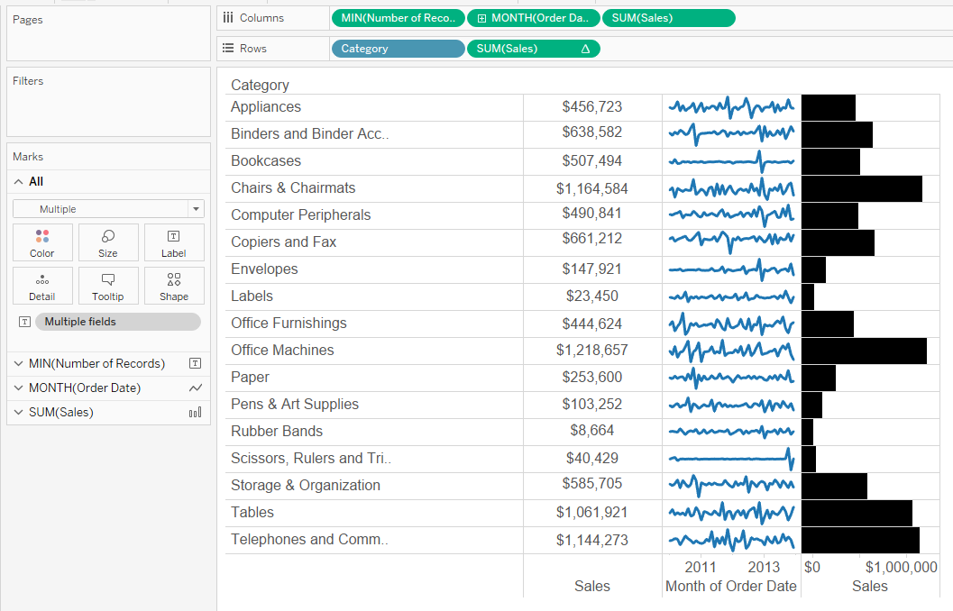
Challenge Jedi 8 – Crosstab with Sparklines
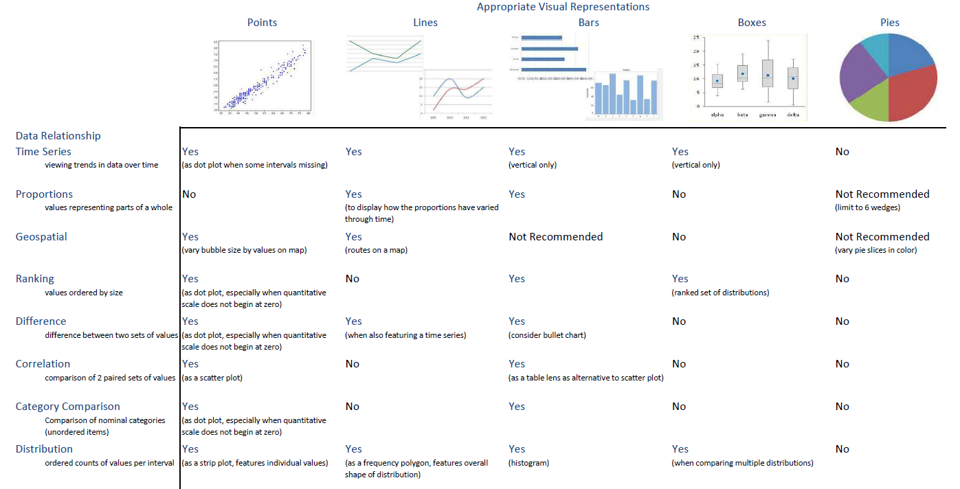
Rules from the White Paper
Tableau’s WhitePaper Visual Analysis Guidebook
· Trend – line, area (amplifies legend dimension pattern), bar (amplifies x axis pattern)
· Comparison – bar
· Correlation – scatter, combining multiple charts in one view
· Distribution – box plot, histogram
· Part to Whole – stacked bar
o Don’t use pie charts
· Geographical – encourage use of pie charts on maps
· Put the most important data on the x/y axis and less important data on color, size, or shape.
· Avoid vertically-oriented labels (hard to read) – if you feel you need vertical labels, try rotating the view.
· It’s hard to compare side-by-side horizontal bars, put them above and below each other.
· Tableau loves bullet charts, especially for actual vs target comparisons.
· Limit the number of colors/shapes to 7-10.
· Color:
o Consider how your use of color will be interpreted.
o Use a meaningful midpoint for color ranges, zero is usually meaningful.
o Avoid adding color encoding for more than 12 distinct values.
· Fonts: Okay to use:
§ Trebuchet MS (especially for numbers/tables)
§ Verdana (especially for numbers/tables)
§ Arial
§ Georgia
§ Tahoma
§ Times New Roman
§ Lucida sans
§ Calibri (tooltip only)
§ Cambria (tooltip only)
· Tooltips:
o Use most important part of tooltip as a title
o Make measure names specific and understandable
o Make sure to include units for all numbers
o Include callouts, format them differently – with lighter shade and smaller font
· Axes:
o Fix range if possible
o Include units when necessary and format values properly
· Place the most important view in the top left.
· Limit dashboards to 3-4 views.
· Keep a single color scheme across views if possible. No more than two color palettes.
· Group filters together with a layout container, include legend in the container if it applies to all views.
· Use interactive views only when necessary
o Include subtle instructions for users in titles or captions to show them they can interact.
o Use highlights to emphasize patterns
· Filters
o Consider how filters interact with highlights
o Apply filters to all views wherever possible
o Turn on show less value if filters cascade
o Order the values in quick filters in a way that makes sense for users
o Add dynamic titles to views that reflect the filter selections
o Consider using the apply button for filters
o Slider filters for numerical and date values, list filters for dimensions
o Check filter states before publishing – don’t publish with filtered data and mislead
· Sizing
o Use range sizing to avoid scroll bars or scrunched views
o Clear any manual sizing unless absolutely necessary
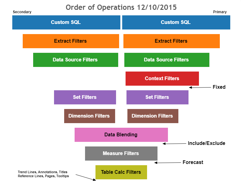
Order of Operations within Dimension and Set Filters
Resolving Data Blending Issues
Cannot blend the secondary data source because one or more fields use an unsupported aggregation. - Data blending has some limitations regarding non-additive aggregates such as COUNTD, MEDIAN, and RAWSQLAGG. Non-additive aggregates are aggregate functions that produce that cannot be aggregated along a dimension. Instead, the values have to be calculated individually. Can occur:
·
Groups in the primary data source
·
Non-additive aggregates from the primary data
source.
·
Non-additive aggregates from a multi-connection
data source that uses a live connection
·
Linking field in the view before the use of
an LOD expression
·
Published data sources as the primary data
source
Asterisks show in the sheet - When you blend data, make sure
that there is only one matching value in the secondary data source
for each mark in the primary data source. If there are multiple matching
values, you see an asterisk in the view that results after you blend data.
Null values appear after blending data sources - Null values can sometimes appear in place of the data you want
in the view when you use data blending. Null values can appears for a few
reasons:
·
The secondary data source does not contain values for the
corresponding values in the primary data source.
·
The data types of the fields you are blending on are different.
·
The values in the primary and secondary data sources use
different casing.
Blending with a cube (multidimensional) data source - Cube data sources can only be used as the primary data source
for blending data in Tableau. They cannot be used as secondary data sources.
·
For issues sorting on a calculated field, see Sorting by Fields is Unavailable for Data Blended
Measures.
·
For issues with a computed sort, see Sort Options Not Available from Toolbar When Data
Blending.
![]() Actions do
not behave as expected
Actions do
not behave as expected
·
Fields from the secondary data source cannot be added to a URL
action. See Fields from Blended Data Source Unavailable for
URL Actions.
·
Action filters are not behaving as expected. See Action Filters with Blended Data Not Working as Expected.
![]() Unexpected
values and field changes
Unexpected
values and field changes
·
Invalid fields when using COUNTD, MEDIAN, and RAWSQLAGG.
See COUNTD Invalid in Published Data Sources When Blending.
·
Duplicate totals after every date value in the view. See Issues with Blending on Date Fields.
·
Latitude and longitude fields are grayed out. See Error "Invalid field formula" Creating Map.
·
Underlying data shows different values than blended data.
See Underlying Data from Secondary Data Source Not Displayed
or Consistent with Blended Data.
Nested LODs
·
Golden Rule - The inner expression in the nested LOD inherits
its dimensionality from the outer expression.
·
Exception – Fixed nested within Fixed: The inner Fixed expression overrides the outer Fixed expression.
LOD Examples
Average Profit per Order
Profit per Order ID -- { INCLUDE [Order ID] : SUM( [Profit] ) }
Customer Order Frequency
Cohort Analysis
Daily Profit KPI
Percent of Total
New Customer Acquisition
First Order Date -- {FIXED [Customer ID]: MIN([Order Date])}
New or Existing -- IIF([First Order Date] = [Order Date], "New", "Existing")
Build the viz:
1) Bring Day
of Order Date to Columns.
2) Bring
count distinct of Customer ID to Rows.
3) Bring New
or Existing to the Filters shelf and keep "New" only.
4)
Right-click on the pill on Rows and select add a Quick Table Calculation >
Running Total.
5) Bring
Market to Color.
Second Order Date – {
FIXED [Customer ID] : MIN(IF [Order Date] > [First Order Date]
THEN [Order Date] END)}
the average number of Unprofitable Orders per Customer, for each Segment?
Perc of Unprofitable Orders -- SUM( [Num Unprofitable Orders] ) / TOTAL ( SUM ( [Num Unprofitable Orders] ) )
“What is the most costly Order to ship by Country, for each of the 4 Markets?”
{ FIXED [Market]:MAX({ INCLUDE [Order
ID],[Country]:SUM([Shipping Cost])})}
“What is the most costly Order to ship by Country, for each of the 4 Markets?”
MAX({ INCLUDE [Country], [Order ID]:SUM([Shipping Cost])})
Guided Analysis – Outliers: Free units over threshold
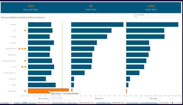
Bar chart with threshold line.
Placeholder – little dots – max(-0.001) on columns beside the sum(units)
Create customers above threshold. If ({fixed: [industry], [cust name] : sum(free units)/sum(total units)} > Threshold then [Cust Name] end
Drag this to detail and change the mark to dots for the max(-0.001) only
Then add cust above threshold to the color.
Proportional Brushing : Comparing to the total. E.g., comparing Italy sales to the EU in the same chart
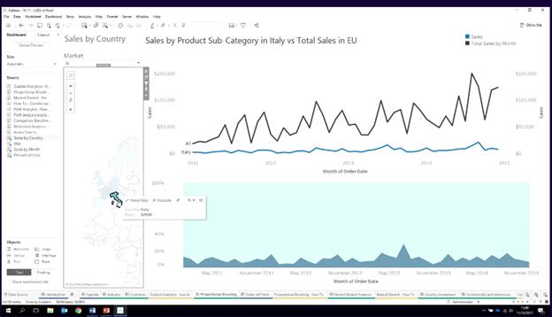
Drag sum(sales) to columns – Affected by Dimension filters.
Create {fixed month(order_date): sum(sales)} – But this wont be affected by the Dimension filter.
But it needs to. Change the market filter to the Context.
Dual axis and Sync Axis.
Now if you add Country filter, the sum(sales) will change, but the Fixed one wont change!
Market basket analysis : Click on one and get other categories which were bought without self join:
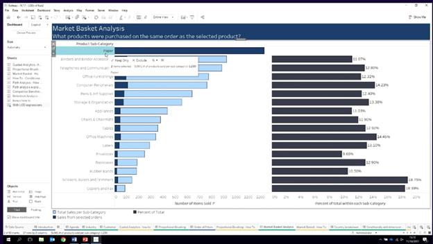
Product sub category to rows and sum(sales) to columns
Create {fixed product sub category: sum(sales)} – Doesn’t move
Then drag this to the Columns
Add order id to the details.
Add filter action from worksheet to worksheet – filter on order id only
Remove Order ID from fixed calc
When you click on paper, that sum9sales changes but the fixed doesn’t change.
Now Dual axis + Sync axis.
Now when you click on Paper, you will see the pic above.
Country Comparisons: Show total when nothing or more than threshold of 10 countries are selected
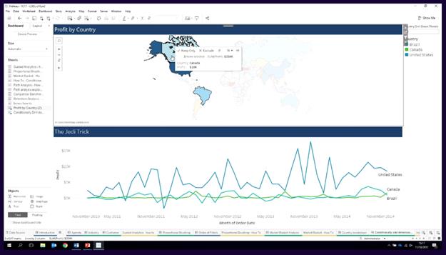
How many countries selected – How?
{Countd(countries)} – All countries - 147 straight line
If you add the action filter to the context, fixed will show number of countries.
Calc – if {countd(countries)} < threshold then [Country] else ‘All’ end
Put this on color
Path on a map: Donations from which country to which country and sized by amount
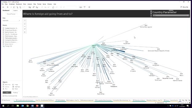
Structure of the data –
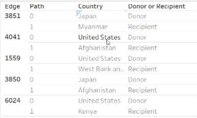
Create calc – Selected Country - IIF([Country] = [Country Parameter],1,0)
Create calc – Donor and Receipient - {FIXED [Edge]: MAX(IIF([Country] = [Country Parameter],1,0))}
Create Calc – For Filter - {FIXED [Edge]: MAX(IIF([Country] = [Country Parameter],1,0))} = 1
Create Map – Avg(latitude) on Rows Avg(Longitude) on Columns + Path on Color (Light to Dark) + Sum(Grants) to Size + Edge to the Details + Path to Path Card + Country, Sum(total grant), attr(donor or receipient) on Tooltips + For Filter on the Filter Shelf to True
Resources
Links
· Online Help: http://onlinehelp.tableau.com/current/pro/desktop/en-us/viz_in_tooltip.html
· Sample: https://www.dataplusscience.com/TableauTips12.html
· Sample: https://www.dataplusscience.com/TableauTips13.html
Syntax
<Sheet name="Tooltip: Profit by
Sub-Category" maxwidth="300" maxheight="300" filter="<All
Fields>">
Notes
Must to use Viz in tooltip.
Specific Filter can be used in a VIT. Size can be changed too. Max best practice is 600X600.
Same sheet but with different LOD can be used. So 2 sheets can be shown. Maybe 1 aggr and second individual state.
Parameter - Which tooltip and Size can also
be controlled by a parameter. e.g., Show
profit/sales/shipping.
Use Cases
1. Change level of granularity (zoom). Hovering over year can show month details. Individual values can be shown too.
2. On a map show trending or distribution by state or data points. Flip works too.
3. Scatter plots can be shown for correlation. Legend and actual numbers can also be shown.
4. Can be used to give context to the number. e.g., how is the number within the min and max months/Bullet chart.
SELECT
['Worksheet1$].[FieldName1].
['Worksheet1$].[FieldName2].
....
FROM
['Worksheet1$']
UNION ALL
SELECT
['Worksheet2$].[FieldName1].
['Worksheet2$].[FieldName2].
....
FROM
['Worksheet3$']
UNION ALL
SELECT
['Worksheet3$].[FieldName1].
['Worksheet3$].[FieldName2].
....
FROM
['Worksheet3$']
Create a Pareto Chart (Online Help)
- Create bar chart by Sub-Category in
descending order for Sales
- Add a line chart that shows Sales by
Sub-Category
- Add table calculation to show Sales by Sub-Category as Running Total
and as Percent of Total
- Primary Calc: Sum Running Total (Compute Using Table
(across))
- Secondary Calc: Percent of Total (Compute Using Table (across))
- Change the color of the line
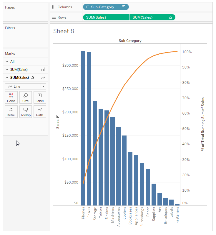
Pareto Charts - How many dimensions items are contributing
to measures. Used for 80-20 rule
https://www.tableau.com/sites/
e.g., How
many products are contributing to sales.
Bring Product ID to COlumns - Add All members
Line Chart:
Bring Sales to Rows -
Sort Desc and Fit Width
Right Click on Sales -
Add Quick Table Calc - Running Total
Edit table calc - Specific Dimension - Verify Product ID is checked.
Add secondary calc choose % of total.
Control click drag a copy
of Product ID from Columns to the Detail shelf.
Right click on the
Product ID pill on Columns change the aggregation to Count Distinct.
Right click again and add
a quick table calculation for Running Total.
Right click again and
select Edit Table Calc. Click Specific Dimensions and check Product ID to make
this an addressing field, and perform a secondary calculation, of type Percent
of Total.
Finally, change the mark
type to line.
Bar chart:
Bring a new copy of sales
to the Rows shelf,
right
click on this second copy of Sales and choose Dual Axis.
Change the mark type for Sum
of Sales to a bar. Resize to tiny.
Right click on the
right-hand Sales axis and select Move Marks to Back,
Uncheck Show Header and
we’ll edit our colors so the line is blue.
Reference Line:
Analytics tab, bring out
a constant line to count distinct of Product ID.
Set the value to 0.2.
Bring out another
constant line to the Sum of Sales with the table calc,
indicated by the delta symbol. Set the value to 0.8.
Step-by-step Instructions
1. Connect to your (generally Excel) datasource that will hold the coordinates. Include a field called LOOKUP with values in it so that you can check if everything is working.
2. Make sure your coordinate fields are dimensions and are set as geographic lat or long fields.
3. Under the Maps menu, click on background images and select your datasource. Assign the lat and long fields.
4. Drag your lat and long fields to the columns/rows as you would with a normal map and your image will appear as the background of the map.
5. To get the coordinates of the places for your marks, click on the location you’d like your map to be and select Annotate. This will give you the lat and long of the place that you clicked.
6. You’re all set!
Resources
· https://www.evolytics.com/blog/how-to-map-anything-in-tableau/
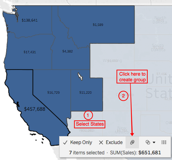
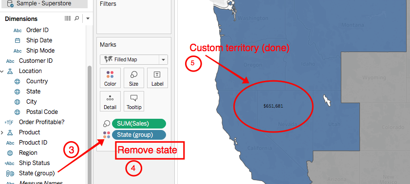
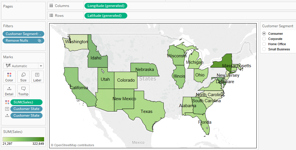
Map with Territory Group
3 Options
Option 1: Select and group locations on a map.
Option 2: Create a territory from a geographic field
Option 3: Geocode a territory field using another geographic
field
Step-by-step Instructions for Option 1
1.
Select marks
2.
Create groups
3.
Put new group to color
4. Remove low level geography from the viz (remove states in screenshot)
5.
You’re all set!
Resources
Sets
Sets are subsets of your data that are also
based on existing dimensions. Sets get their own special area in the data pane.
You can create a set visually by selecting marks or you can create a computed
set by using logic that creates conditions on how the IN/OUT membership of the
set will be calculated.
3 Types
·
Constant
· Computed
· Combined
Resources
Uses
· Need to set coloring scheme per column based upon calculated field logic.
· Need to mix and match mark types within a crosstab.
· Need to have different tool tips for each column in a crosstab.
Steps
1. Create Placeholder calculated field (normally min(0) or min(1) ).
2. Add Placeholders to columns (as many as needed)
3. Add measures, one at a time, to each Placeholder’s Marks Text.
4. Add dimensions to Rows.
5. Marks Card
a. Set Mark Type to Text
b. Mark’s Size and Mark’s Color will override size and color Mark’s Text
c. Format Lines -> Columns -> Grid Lines -> None
6. Remove Headers at Bottom (Right Mouse click + Show Headers)
7. Add sheet to a dashboard.
8. Add a floating Text box. Align to the header and enter in column names. Sheet should be fixed width.
Control Charts - Establish if variation in measurement is
within acceptable bounds. Done with Time Series. How many marks are out of bounds.
Create Param - # Standard Deviation - List 1, 2, 3
Create Calc - Lower Bound - WINDOW_AVG(SUM([Profit]))
- (WINDOW_STDEV( SUM([Profit])) * [Standard Deviations] )
Create Calc - Upper Bound - WINDOW_AVG(SUM([Profit]))
+ (WINDOW_STDEV( SUM([Profit])) * [Standard Deviations] )
Create Calc - Outliers - SUM([Profit])
< [Lower Bound] OR SUM([Profit]) > [Upper Bound]
Drag Month (Columns) Sum(profit) (Rows)
Drag measure Values to
the Rows shelf and keep only Upper and Lower bounds.
You should see 2 lines.
Dual axis - Sync Axis -
Uncheck Show Header
Bring Outliers to Color -
Edit Colors for True/False + Show Marks
Change Upper and Lower
bound lines to Gray.
Changing the Std dev changes the number of
marks outside the Lower and Upper bounds
Funnel Chart - Sales Funnel, Candidates interview process,
phase of sales.
Data set - Number of
Prospects in our sales funnel and in which phase.
Drag #Prospects to COlumns and Phase to Rows.
Change Mark Type to Area
Sort Phase according to
phases.
Fit Entire View
Create Calc - Negative # Prospects = - #Prospects
Bring -ve to Left of +ve #Prospects
Tidy the view - Hide
headers, Format Borders for no column divider
Bring Phase to label on
the -ve
Bring #Prospects to label
on +ve
Change Label on +ve to % of Total
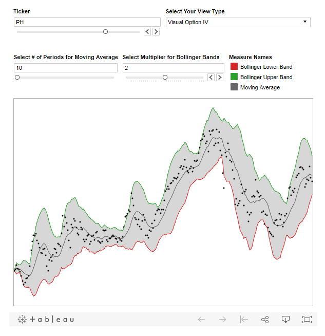
Bollinger Bands - Financial Analysis - Under or oversold
using Moving average.
Create Param - Lookback Period - Int -
Range 1 to 50 - Curr 20
Create Param - # Standard Deviations - Range 1 to 4 - Curr 2
Create calc - Moving Avg - window_avg(avg([Closing Price]), -[Lookback Period], 0)
Create calc - Standard Deviation - window_STDDEV(avg([Closing
Price]), -[Lookback Period], 0)
Create calc - Upper Bound - Moving Avg +
[# Standard Deviation] * [Standard Deviation]
Create calc - Lower Bound - Moving Avg -
[# Standard Deviation] * [Standard Deviation]
Bring - Avg(Closing Price) to rows, [Moving Avg}
to rows, Dual Axis, Bring upper and lower bound to the same axis, Sync Axis,
Uncheck Show header.
Make all bands to be gray
(upper, avg, Lower)
Mark anything outside std dev - Outside Band - Avg(Closing Price) <
Lower Bound OR Avg(Closing Price)> Upper Bound
Bring Outside
Band to color and change color to Blue and Red (Outside)
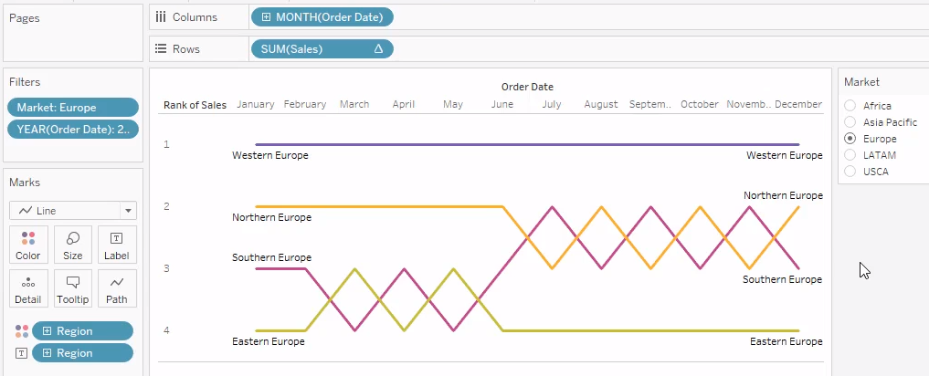
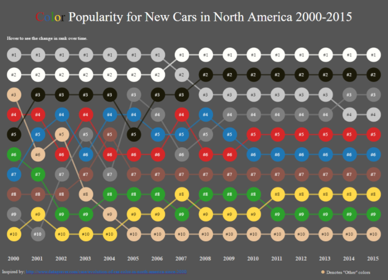
Bump Charts - Line Chart
- Shows change in RANK over TIME (months) - Start, middle and end are ranks
Looking at Profits across
Markets.
Drag profits (rows) and
month (Columns)
Right Click on profit -
Apply Quick Table Calc - Rank
Right Click again -
Compute using to Market
Right Click - Profit to
discrete
Make sure mark is Line.
Bump Charts - Line Chart - Shows change in RANK over TIME
(months) - Start, middle and end are ranks
Looking at
Profits across Markets.
Drag profits
(rows) and month (Columns)
Right Click
on profit - Apply Quick Table Calc - Rank
Right Click
again - Compute using to Market
Right Click -
Profit to discrete
Make sure
mark is Line.
- Create the custom M/D/Y date
- Sort that custom date in descending
order (do so on the field in the Measure pane itself and not in the view)
- Add the quick filter to the viz
Formatting Numbers to Thousands
Formula for Formatting Numbers to thousands or millions as necessary (does not add commas)
if sum([Visits])
>= 1000000 then str(round(sum([Visits])/1000000,
2)) + 'M'
elseif
sum([Visits]) >= 1000 then str(round(sum([Visits])/1000,
2)) + 'K'
else str(sum([Visits]))
END
Split Customer Name
Separate customer names into first and last names as separate dimensions. Account for Middle Names
Option 1 - Custom Split - Use Space and First Split + Custom Split 2 - Use Space and Last Split.
Option 2
Last Name
trim(if
FINDNTH([Trim Cust Name], " ", 2) > 0
then right([Trim Cust Name], len([Trim Cust Name]) - FINDNTH([Trim Cust
Name], " ", 2))
ELSE right([Trim Cust Name], len([Trim Cust Name]) - FINDNTH([Trim Cust
Name], " ", 1)+1)
END )
First Name
left([Trim Cust Name],
FIND([Trim Cust Name], " "))
Format YYYYMMDD String Into Date
Convert the date 20070425 into a date format recognized/usable by Tableau.
Option 1 - DATEPARSE("yyyyMMdd",
STR([Dates]) )
Option
2 - date( left(str([Dates]),
4) + "-" + mid(str([Dates]), 5, 2) +
"-" + right(str([Dates]), 2) )
Format Date into an MM/DD/YYYY Formatted String
By default, Tableau shows dates converted to strings in the format YYYY-MM-DD.
To display it as MM/DD/YYYY (force leading zeros for month and day):
right('0'+str(datepart('month',[Date])),2)+'/'
+right('0'+str(datepart('day',[Date])),2)+'/'
+str(datepart('year',[Date]))
To display it as mm/dd/YYYY (do not force leading zeros for month and day):
str(datepart('month',[Date]))+'/'
+str(datepart('day',[Date]))+'/'
+str(datepart('year',[Date]))
Tableau borrows custom number formatting from Excel with several limitations.
Examples
Here is an arbitrary selection of examples:
|
Add text next to the numbers: |
"Profit:"
#,##0.00;"Loss:" -#,##0.00; |
|
Replace the numbers by text: |
"Profit";"Loss" |
|
Numbers in tens: |
0"."0;-0"."0 |
|
Numbers in hundreds: |
0"."00;-0"."00 |
|
Numbers in trillions: |
#,##0,,,,.00T;-#,##0,,,,.00T |
|
Show only positive values: |
#,##.0; ; |
|
Show only negative values: |
; -#,##.0; |
|
Add leading zeros to a number: |
#,### 000000000 |
|
Split numbers into dollars and
cents: |
#,## "USD &" .00
"Ct"; - #,## "USD &" .00 "Ct" |
|
Add symbols: |
#,##0º |
|
Show Quarter instead of Q: |
yyyy "Quarter" q |
|
Times instead of dates: |
hh:mm:ss |
|
Only the months: |
mmmm |
|
Show the full date and am/pm time: |
ddd, mm/dd/yyyy,
hh:mm am/pm |
|
Special syntax like telephone
numbers: |
(###) ###-###-### |
|
Don’t show anything at all: |
; |
Limitations
· No
Color Coding
· No
Comparison Operators
· No
Repetition of Text
Resources
· Tableau Custom Number Formats (Clearly and Simply)
· Custom Excel Number Formatting
- Create calc
field
- Name: Rank Formula: RANK(SUM([Profit]), ‘desc’)
- Convert calc
field to Discrete
- Drop Rank onto Rows between 1st
and 2nd Dimensions
- Set Compute Using to Pane Down
- Unclick show header to remove Rank
from the view
Example (Global Superstore 2016)
***
The
cool feature that we saw in Superstore workbook, where clicking on the tooltip highlights
the specific items/category was because of a feature/selection in the tooltip
properties - "Allow Selection By Category".
Seems this is a 10.3 feature - https://www.tableau.com/about/blog/2017/4/sharpen-your-analysis-tooltip-selection-tableau-103-68761
This means that we should include all Dimensions in the tooltip to help with the analysis. Highlighting will surely help.
Summary on the top in the form of charts or big numbers. Details at the bottom.
Use less colors. Use color blind pallete.
Tooltips and interactions important.
Storyboard in the end to present the story.
jitterring with box plot is cool.
4 questions in total
Q1 - 30 min - 17% - Best Practices
Q2 - 30 min - 17% - Specific Questions
Q3 - 60 min - 32% - Dashboard 1
Q4 - 60 min - 32% - Dashboard 2
Are you as Tableau-smart as Tableau Consultant?
Use Reference Line:
1. Constant = value
2. Set Line = None.
a. Note there is no way to hide the tool tip of the reference line.
1. Parameter (Map or Graph)
2. T/F Filter based on 1 value of Parameter. Example: [Parameter Choose Chart] = “Map”
3. Add T/F Filter to each sheet, one set to True and one to Exclude True).
4. Combine 2 chart sheets into a container and hide the titles.
5. Show the Parameter Control.
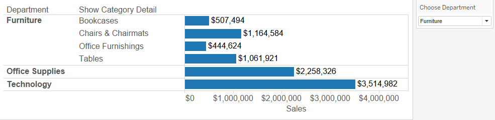
1. Create a string parameter with the three different departments (e.g., Office/Furniture/Tech).
2. Create a calculated field with a logical IF statement
IF [Choose Department] = [Department] THEN [Category] ELSE
"" END
Option 1 - Make parameter with all measure names + Calc field with Parameter and Measure Names + Drag dimensions and Calc field + Parameter Control
Option 2 - Just drag Measure Values on the shelf + Filter on Measure Values + Drag Dimensions and Measure Values + Filter on Measure Names
Option 1 - Create set with non-null values and use it as filter
Option 2 - Duplicate field and add the second as the filter with no nulls.
Sort the bar chart by sales in the east and label the percentage of total sales for each region. Add a label for the total sales of each bar at the end.
Create "East Sales" field, Add it to Detail, Sort using "East Sales" + Duplicate sum(sales), Add Perc of Total, Drag to Label + Reference Line for Sum(sales), value
Date (Columns) and Sum of profit (rows) + Running Total on profit + Mark type to Gantt + Size by negative Profit + Color by Profit
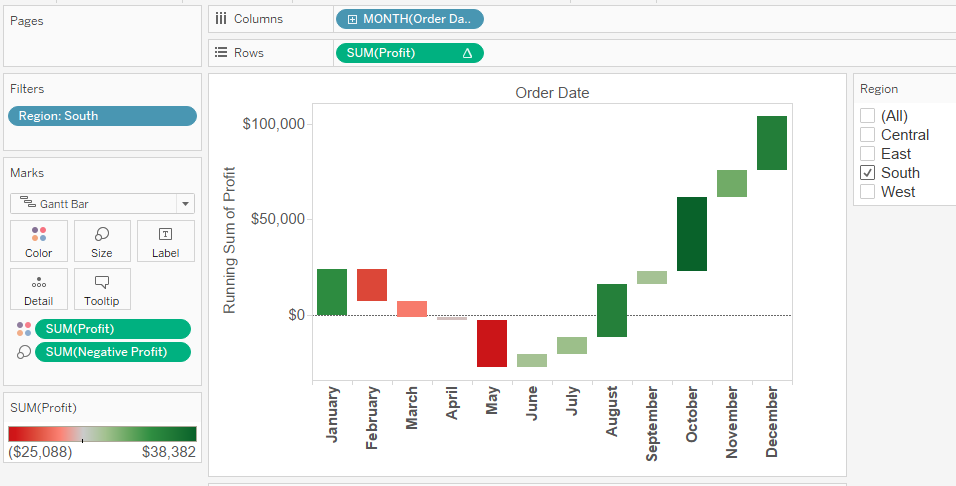
Duplicate Cnt(profit) + Add Quick Calc Running Total + Dual Axis
Show the average sales by order for each region. Multiple items per order id.
Option 1 - sum(sales)/countd(order_id)
Option 2 - LOD - {include order_id: sum(sales)} + Drag on shelf + Change aggr from Sum to Avg.
Market basket analysis - Order ID Contains Multiple Categories
Excel sheet - Join Orders to Orders on "order_id = Order_id" and "category <> category"
Drag Category from first to Rows, from Second to Columns
Countd(order_id) - Drag to text and Color
Move Measure Names and Values to the shelves + Move Measure Values to Color + Right Click Measure Values and Choose "Use Separate legends"
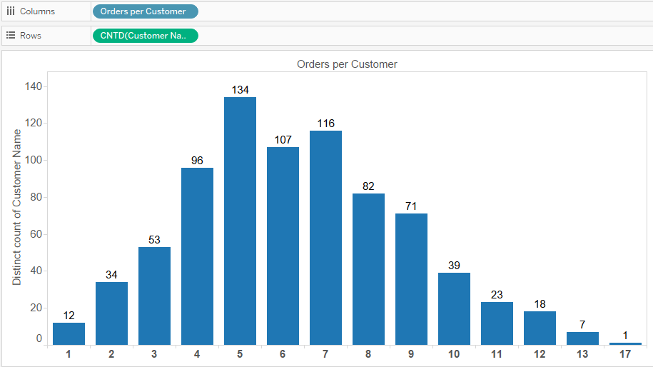
Create a histogram of the number of customers who made 1, 2, 3 etc. orders.
Orders per Customer:
{FIXED
[Customer Name]: COUNTD([Order ID])}
Distinct Number of Customers:
countd(customer name)
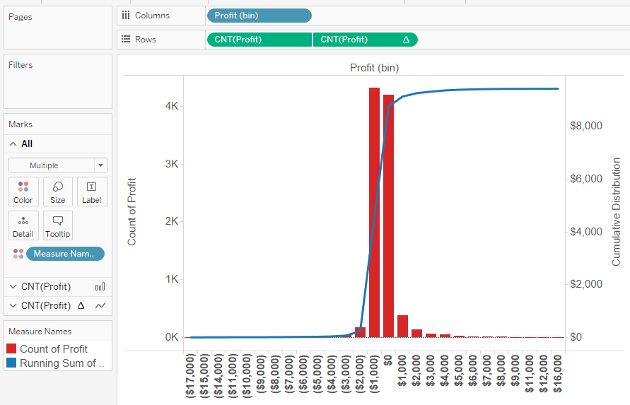
How many days within each month have negative profit days versus positive profit days?
Option 1 - Create set of Order date with condition sum(profit)>0 + Drag Set on Color and Columns + Countd(order_Date) on Columns + year and month on Rows
Option 2 - Create LOD: { FIXED [Order Date] : SUM([Profit]) } > 0 + Use this instead of the set above.
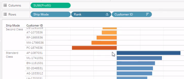
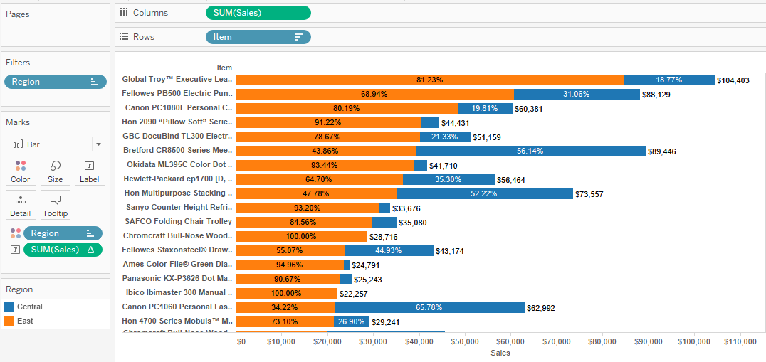
Sort each item by sales within each region and filter down to the top N in each region.
Option 1 - Rank(sum(sales), 'desc')) + Convert to Discrete (IMP) + Move between Region and Item + Calculate Pane(Down) + Parameter TOP N + Filter Rank <= Top N
Option 2 - Use Index (Detailed calc) = Right click index and “edit table calculation”. Choose “advanced” in the compute using. Address by region then item and sort by field sum of sales descending. Choose restarting every region.
Create a top ten conditional filter that will update the top ten based on the selection in a filter.
Add filter to context
Display the top 10 category/region combinations.
Combine the 2 fields + Drag field + Sort that field by sum(profit) + index + Filter on index
Using
Path Shelf Pattern Analysis
Use custom sql
to reshape the data in the correct format. The query looks like the
following:
SELECT
<Parameters.Choose Center State> AS [State
Path],
['State paths$'].[Sales] AS [Sales],
['State paths$'].[Unique Path] AS [Unique Path],
1
AS [Path]
FROM
['State paths$']
UNION
SELECT
['State paths$'].[To State] AS [State Path],
['State paths$'].[Sales] AS [Sales],
['State paths$'].[Unique Path] AS [Unique Path],
2
AS [Path]
FROM
['State paths$']
This does two things. It brings the “To State” under the “From State” and labels the To and From with a 1 or 2. The To and From state columns are both named “state path”. The last part is to make the from state dynamic by putting in a state name parameter.
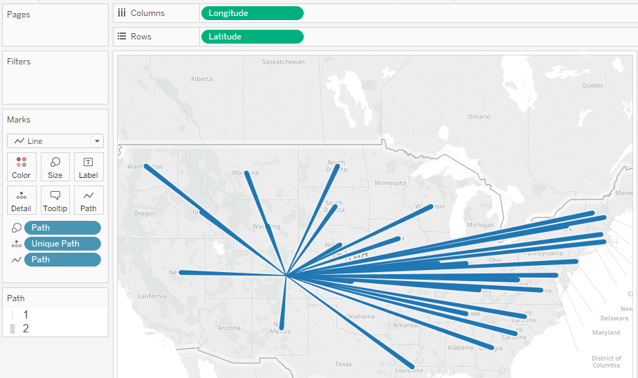
Basic map building blocks:
|
Columns shelf: |
Longitude (continuous dimension, longitude geographic role
assigned) |
|
Rows shelf: |
Latitude (continuous dimension, latitude geographic role assigned) |
|
Detail: |
Path ID field (discrete dimension) |
|
Mark type: |
Line |
Tableau Challenge Jedi 8 – Crosstab with Sparklines
1. Add minimum number of records to the columns to fake the crosstab axis. Place the sum of sales on the label in this marks card. Change the mark type to text.
2. Add continuous month to the columns and sum of sales (with a difference table calculation to make it interesting) to the rows. Make the mark type line. Make the axis independent.
3. Add sum of sales to the end of the columns. Make the mark completely transparent. Add a reference line to the sum of sales. Fill below the line.
4. The rest of the exercise is simply formatting. Shrink down the cell sizes and remove unnecessary grid lines.
Familiarize with SUPER STORE DB
To do - 3/15/2018
NESTED LOD - Ricardo
Blending - Limitations + Cartesian product + Generate data in Tableau - Ricardo
Usage for index vs Rank - Rachel
Excel Specific Features - Ingest piece
Add to context - doesnt work for Region and Category for Sales and Top 3! Categories get filtered but the TOP function is not implemented at Region and Category level, its just at the region level. - Ricardo
Sparkline With Min/Max Highlighted